


Zomato 2015 Brand Guidelines Case Study
In the dynamic landscape of food-tech enterprises, Zomato has consistently positioned itself as a formidable player, spearheading innovation in the restaurant discovery and food delivery domain. By 2015, Zomato had evolved from a simple restaurant listing service to an expansive ecosystem that facilitated seamless interactions between restaurants and customers. In the pursuit of a coherent brand identity amidst exponential growth, Zomato meticulously crafted its brand guidelines, ensuring visual consistency, linguistic tonality, and strategic market positioning.
Visual Identity and Aesthetic Consistency
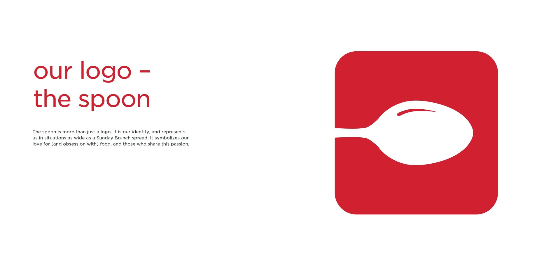
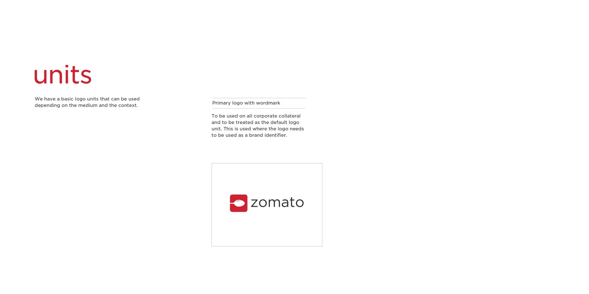
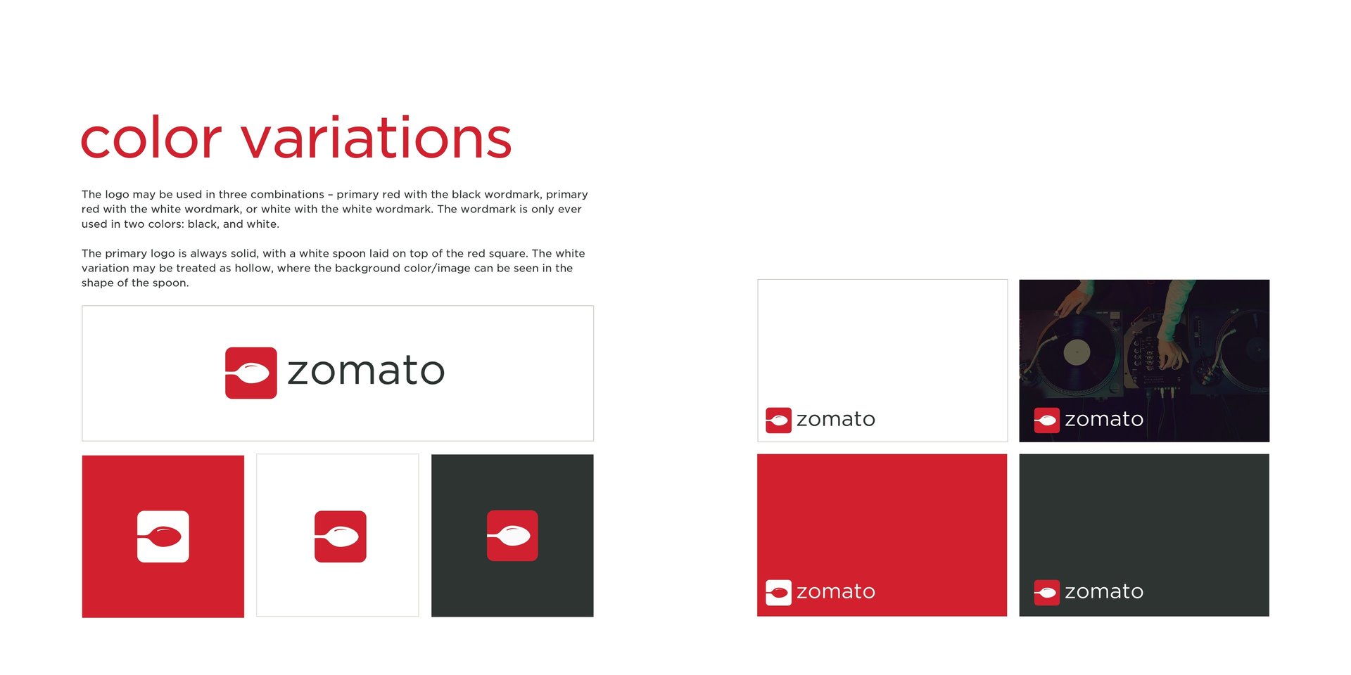
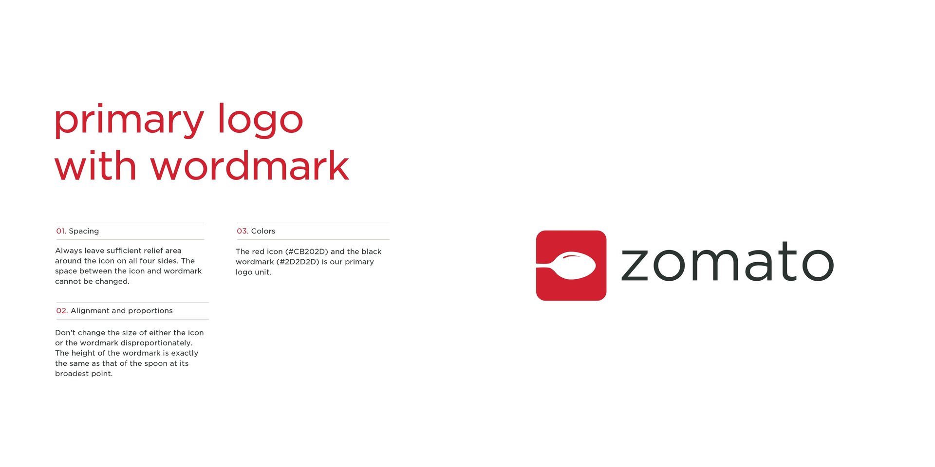
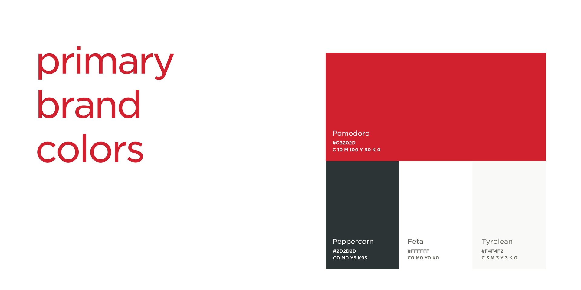
Zomato's 2015 brand identity was a masterclass in minimalism fused with vibrancy. The company transitioned to a dominant red color scheme, reinforcing a sense of passion, appetite, and urgency associated with food. The sleek, modern typography employed a sans-serif typeface, exuding a contemporary yet approachable aura. The logo, which underwent subtle refinements, embraced a sharper, more refined aesthetic while retaining its recognizability.
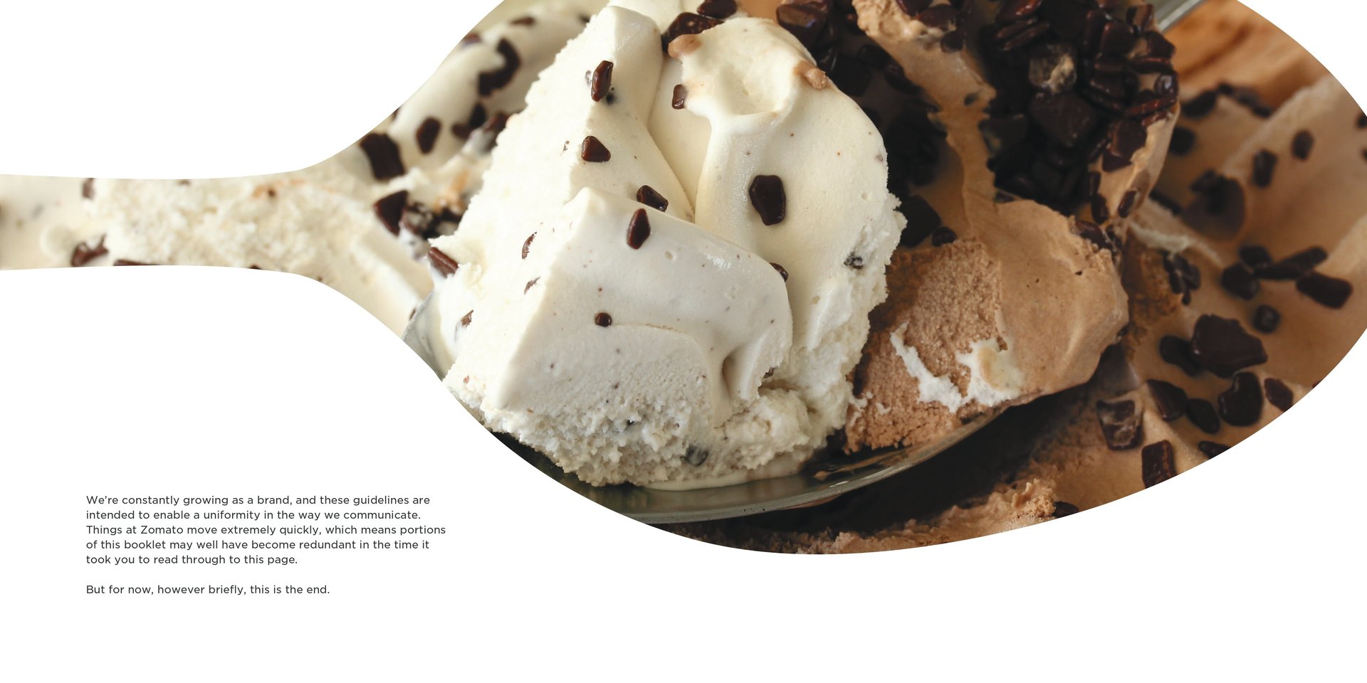
Imagery played a pivotal role in Zomato’s branding, with high-resolution, authentic food photography becoming a staple in their digital and print assets. The visual lexicon was meticulously curated to elicit an emotional response from users, making food the undeniable hero in all creative representations. The strategic use of negative space ensured that design elements maintained clarity and impact, fostering a seamless user experience across platforms.
Tone of Voice and Linguistic Strategy
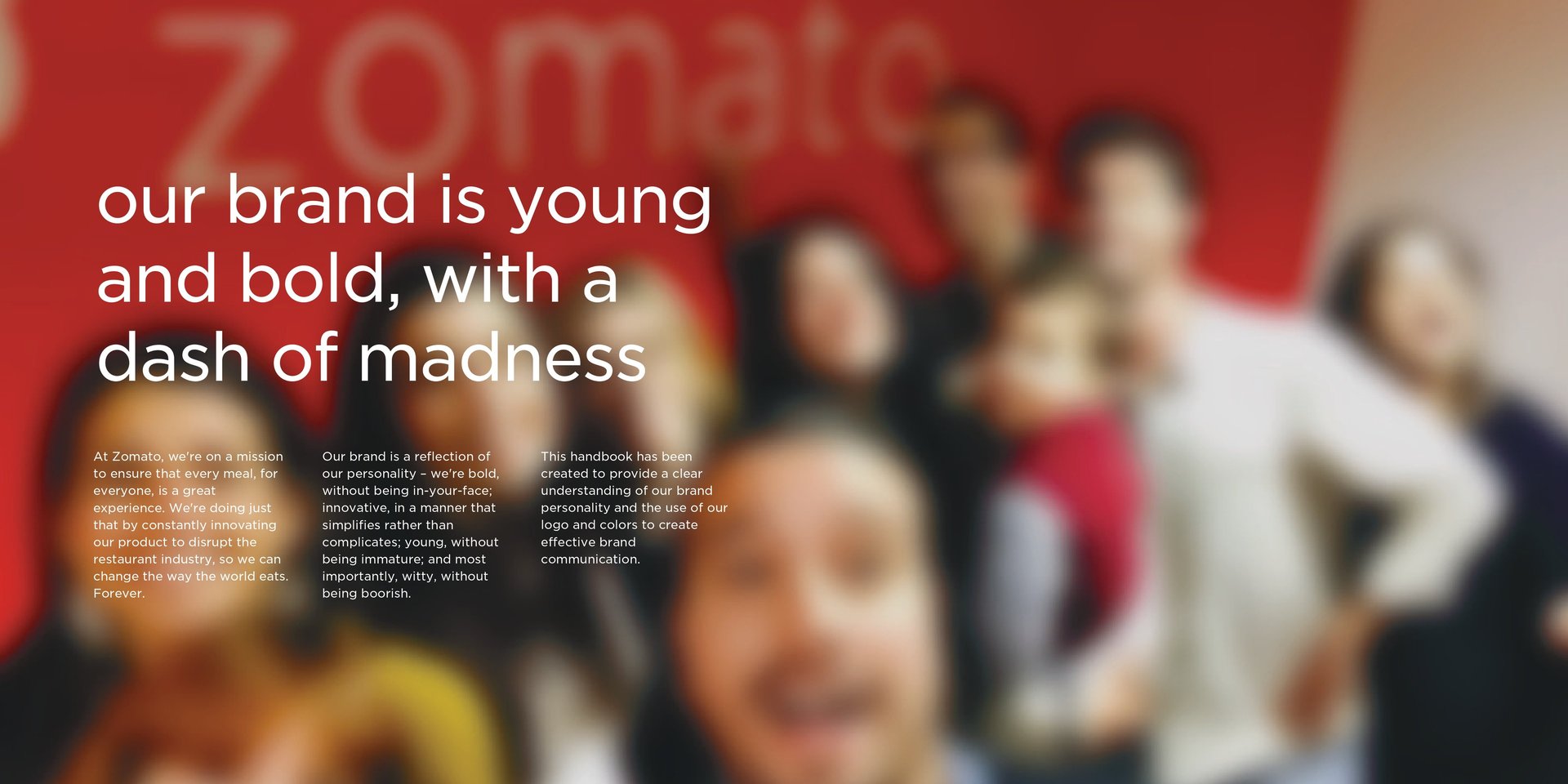
Zomato’s brand communication in 2015 exemplified wit, relatability, and an intrinsic understanding of its audience’s behavioral patterns. The copywriting adhered to a tone that was both conversational and insightful, often interspersed with humor and cultural references that resonated with millennials and urban professionals. Whether through app notifications, social media campaigns, or restaurant reviews, Zomato consistently employed a voice that was both authoritative and engaging, effectively distinguishing itself from its competitors.
Content strategy was another cornerstone of Zomato’s brand guidelines. The company emphasized brevity and clarity, ensuring that every written interaction was concise yet impactful. The ubiquitous presence of cleverly crafted microcopies in their app and website added an element of delight, strengthening user retention and reinforcing brand recall.
Strategic Market Positioning
By 2015, Zomato had transcended its original function of restaurant discovery, venturing into food delivery and global expansion. The brand guidelines played a crucial role in maintaining uniformity across different geographies while allowing room for localized adaptations. The balance between global brand coherence and regional customization ensured that Zomato retained its universal appeal without alienating diverse consumer bases.
Advertising and marketing efforts were seamlessly aligned with the brand ethos, with campaigns pivoting around the themes of food cravings, social dining experiences, and the convenience of discovery. The utilization of user-generated content further amplified authenticity, cementing Zomato’s reputation as a community-driven platform.
Conclusion
The Zomato brand guidelines of 2015 were a testament to the company’s commitment to structured yet flexible branding principles. By focusing on a cohesive visual identity, a distinct linguistic persona, and a well-defined market strategy, Zomato fortified its presence as a household name in the food-tech industry. The deliberate orchestration of design, tone, and engagement ensured that Zomato was not merely a service but an integral part of the culinary journey of millions. This case study exemplifies how a meticulously crafted brand strategy can transcend mere aesthetics and become a powerful tool for sustained growth and consumer loyalty.
Let's discuss your project
Address
India
Global Tech Park, 11, O'Shaughnessy Road, Langford Town, Bengaluru 5600 25
Business Relations
PH: (+91) 90 081 58824
Monday - Saturday
09:00 AM - 06:00 PM (IST Timezone)
Talk to us
Communications - India
WA: (+91) 95 350 28020
Communications - Global
WA: (+91) 740 64 00010
Initial Point of Contact:
hello.castlespace@gmail.com
General Information Requests:
info@castlespace.in
Business and Sales Inquiries:
sales@castlespace.in
Client Assistance Channel:
support@castlespace.in
Press and Media Relations
pr@castlespace.in
Explore Career Opportunities:
careers@castlespace.in
Creative Design Correspondence:
design@castlespace.in
Socials
© Castle Space™ 2012 - 2025
All Rights Reserved by TEIRO SOLUTIONS LLP. Trademark pending for India, UAE, UK (T.No. 6174)
United Kingdom
8 St James's Square
London SW1Y 4JU
Business Relations
PH: (+44) 7342 33 2693
Monday - Saturday
09:00 AM - 06:00 PM (GMT Timezone)
United Arab Emirates
R-311-315, Jumeirah Living
Marina Gate 3, Dubai 1218 28
Business Relations
PH: (+971) 503 641 563
Monday - Saturday
09:00 AM - 06:00 PM (GST Timezone)
pronounced as;
- castle space: /ˈkɑːsl speɪs/
Brand Discovery
CSR
Sustainability
Research
Trend Reports
Global Outreach
Technology
Vetero 2.0
Playbook
Training
Public Relations
Media
Intellectual Property
Influencer Partnerships
Media Gallery
Internships
Consultations
