The Psychology of Colour in Luxury Branding: How Emotion Shapes Elite Identity
Discover how colour psychology influences luxury branding. Castle Space unveils the art of emotional connection through refined, strategic colour choices.
LUXURY
By Disha Jain
3/13/20256 min read
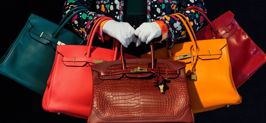
Castle AY25. Photo: WB
The Psychology of Colour in Branding: A Luxury Perspective by Castle Space
At Castle Space, we understand that in the world of luxury branding, every detail matters. From the elegance of your logo to the spacing in your Instagram captions, subtle decisions create substantial emotional impact. Among the most powerful—and often underestimated—tools in the visual identity arsenal is colour. The psychology of colour in branding goes beyond aesthetics; it’s about evoking emotion, shaping perception, and commanding presence. In the luxury sector, where every choice must whisper sophistication and influence, colour becomes an unspoken language—one your audience instinctively understands.
Colour doesn’t simply catch the eye. It evokes feelings, memories, and responses rooted in culture and psychology. Studies consistently show that people make subconscious judgments about a product within 90 seconds of initial viewing—and up to 90% of that assessment is based on colour alone. In luxury branding, where subtlety and nuance are prized, the correct use of colour can be the difference between forgettable and iconic. When a brand evokes exclusivity through rich jewel tones or minimalism through nuanced neutrals, it isn't just being stylish—it's being strategic.
Black is perhaps the most iconic of all luxury colours. It signifies power, elegance, and timelessness. Luxury fashion houses like Chanel and Prada have long leaned into black not just as a colour, but as an identity. Black strips away distraction and centers focus on form, design, and quality. It doesn't clamor for attention, and that is precisely its strength. In branding, black carries an unshakable confidence. It allows typography to breathe and imagery to speak, offering a blank yet commanding canvas that speaks to sophistication and mystery.
White, the counterpart of black, conveys purity, clarity, and perfection. It is the ultimate expression of refined minimalism. High-end skincare brands often lean into white to evoke clinical precision and understated luxury. White spaces are not empty—they are deliberate, offering visual respite and reflecting a quiet assurance that less truly is more. At Castle Space, we often recommend white for luxury wellness brands, lifestyle startups, and high-end interior concepts seeking to establish credibility through calm elegance.
Gold, with its undeniable association to wealth and royalty, is a colour that embodies prestige. However, the use of gold in branding must be approached with restraint. When used tastefully—as a foil, an accent, or a highlight—it elevates a brand, suggesting craftsmanship, history, and exclusivity. Too much gold can shift from opulence to ostentation. At Castle Space, we often see success in pairing gold with matte black or deep navy to strike the perfect balance between modernity and tradition.
Blue, particularly in its deeper hues, is a cornerstone of luxury branding in sectors such as finance, technology, and automotive. It evokes trust, stability, and intelligence. Brands like Rolls-Royce and Tiffany & Co. have used variations of blue to signal both tradition and innovation. Tiffany’s robin egg blue, for instance, has become more than a colour—it’s a trademark, a legacy, an immediate emotional trigger. That’s the power of carefully chosen chromatics. Blue soothes, reassures, and stabilizes—making it a strategic choice for brands seeking to convey authority without arrogance.
Red is more complex. It’s passion, power, love, and danger rolled into one. In the luxury space, red must be wielded thoughtfully. It commands attention, increases appetite, raises heart rates, and accelerates decision-making. High-end sports car brands or heritage fashion houses may embrace red to communicate heritage, desire, or rebellion. Red has cultural weight—what it suggests in Shanghai might differ from what it evokes in Milan—so at Castle Space, our colour strategy always includes an exploration of cultural context alongside psychological impact.
Green is increasingly significant in the luxury landscape, especially in a world pivoting toward sustainability and wellness. In branding, green suggests growth, renewal, and ethical grounding. Luxury brands using green often aim to merge tradition with responsibility. Forest greens feel rooted, historical, and majestic, while mint or sage tones suggest freshness and modernity. As consumer values shift toward transparency and responsibility, green is stepping into the spotlight—subtle, yet deeply persuasive.
Purple, historically associated with nobility and mysticism, is a fascinating colour in branding. It can feel both modern and regal, offering a fresh take on high-end appeal. Purple is rare in nature, which may contribute to its sense of rarity and uniqueness. Used in branding, it speaks to creativity, exclusivity, and introspection. A darker amethyst tone might ground a brand in gravitas, while lavender hues can lighten the mood and invite intimacy. We often turn to purple when helping luxury clients stand apart in saturated markets—when uniqueness is not optional, but expected.
Neutrals such as beige, taupe, and greige are quietly dominating the luxury world. These colours create space for other brand elements to shine. They suggest taste, control, and quiet confidence. Unlike bold colours, neutrals don’t impose—they invite. They’re often the choice of modern minimalist luxury, found in high-end interior design brands, boutique hospitality, and wellness labels. In the age of overstimulation, neutrality is not absence—it’s intention.
Pink, once relegated to femininity and youth, has evolved into a symbol of strength, innovation, and chic rebellion. In luxury branding, dusty rose, blush, and millennial pink are increasingly used to inject freshness, warmth, and emotional connectivity. Pink offers intimacy where red offers intensity. It is emotionally intelligent, psychologically nuanced, and remarkably versatile. We’ve found pink especially potent in beauty, fashion, and tech brands targeting next-generation luxury consumers who appreciate both style and substance.
Brown, though less frequently used, has its moment in high-luxury when associated with craftsmanship and heritage. Think leather, wood, earth—elements of rooted luxury and artisanal mastery. Brown in branding can feel rich, tactile, and timeless. It evokes trust in a different way than blue—less corporate, more grounded. Brands leaning into naturalism, vintage aesthetics, or storytelling through heritage often find brown to be an ideal base palette.
Yellow is perhaps the trickiest colour in luxury branding. Its psychological impact is clear: optimism, energy, creativity. But its cultural interpretations and high visibility can work against the subtlety luxury demands. When used sparingly—often as an accent—yellow can lift and modernize a palette. Mustard, ochre, and saffron tones bring warmth without overwhelming. For brands that want to disrupt traditional luxury codes with cheer and individuality, yellow can be a daring and rewarding choice.
It’s important to remember that colour in branding isn’t isolated—it interacts with typography, photography, texture, and tone of voice. At Castle Space, our brand identity strategies are deeply rooted in cross-sensory alignment. A luxury brand’s colours must feel like an extension of its values, product, and audience. A champagne-toned packaging loses meaning if paired with clashing copywriting or low-resolution visuals. True luxury is cohesive. It feels intentional at every touchpoint.
Cultural interpretation plays a massive role in colour psychology. What feels luxurious in Paris may not land the same way in Dubai or Tokyo. Red can be celebratory in China but aggressive in Scandinavia. Purple may feel spiritual in Western contexts and somber in others. Global luxury brands must strike a careful balance—respecting cultural nuance without diluting their core identity. At Castle Space, we conduct in-depth cultural audits before finalizing any visual identity, ensuring colour choices feel both universal and tailored.
Digital media has added another layer to colour psychology. With screens mediating the majority of brand experiences, colours must be optimized for both digital and print. Some hues that appear rich on paper may flatten on screen, while others may glare under certain lighting conditions. Social media, in particular, is a stage for visual storytelling—colour palettes here must feel curated, scroll-stopping, and cohesive across a grid. We advise brands to test colours across platforms, ensuring they retain emotional resonance whether in a TikTok ad or a luxury print insert.
At Castle Space, we also lean into colour as a strategic tool in campaign cycles. Launching a new collection? Deep moody tones can drive anticipation. Hosting an exclusive summer event? Soft corals, champagne golds, or pastel tones can suggest curated elegance. Planning a limited-edition drop? Unexpected colour accents can generate buzz and urgency. Colour becomes not just a design choice, but a narrative device.
Ultimately, colour in luxury branding is about perception—how your audience feels when they interact with your brand. It’s emotional, primal, and intuitive. It’s about becoming instantly recognizable without saying a word. A single shade can evoke decades of history, a lifestyle aspiration, or a commitment to values. It’s what separates a beautiful brand from an unforgettable one.
At Castle Space, we don’t just pick colours—we decode them. We understand their history, their psychology, their cultural footprint. We align them with your brand’s soul and your audience’s desires. Because in the world of luxury, colour isn’t decoration. It’s identity. It’s emotion. It’s influence.
And it’s our specialty.
luxury
colour psychology
emotions
cultural
influence
experience
Let's discuss your project
Address
India
No. 788, Eterna, 15th Cross Road
1st Phase, J. P. Nagar, Bengaluru 560 078
Business Relations
PH: (+91) 90 081 58824
Monday - Saturday
09:00 AM - 06:00 PM (IST Timezone)
Talk to us
Communications - India
WA: (+91) 95 350 28020
Communications - Global
WA: (+91) 740 64 00010
Initial Point of Contact:
hello.castlespace@gmail.com
General Information Requests:
info@castlespace.in
Business and Sales Inquiries:
sales@castlespace.in
Client Assistance Channel:
support@castlespace.in
Press and Media Relations
pr@castlespace.in
Explore Career Opportunities:
careers@castlespace.in
Creative Design Correspondence:
design@castlespace.in
Socials
© Castle Space™ 2011 - 2026
All Rights Reserved by TEIRO SOLUTIONS LLP. Trademark pending for India, UAE, UK (T.No. 6174)
United Kingdom
8 St James's Square
London SW1Y 4JU
Business Relations
PH: (+44) 7342 33 2693
Monday - Saturday
09:00 AM - 06:00 PM (GMT Timezone)
United Arab Emirates
R-311-315, Jumeirah Living
Marina Gate 3, Dubai 1218 28
Business Relations
PH: (+971) 503 641 563
Monday - Saturday
09:00 AM - 06:00 PM (GST Timezone)
pronounced as;
- castle space: /ˈkɑːsl speɪs/
Brand Discovery
CSR
Sustainability
Research
Trend Reports
Global Outreach
Technology
Vetero 2.0
Playbook
Training
Public Relations
Media
Intellectual Property
Influencer Partnerships
Media Gallery
Internships
Consultations