
Beats Music 2014: A Brand Guidelines Case Study
In an era dominated by streaming giants and algorithmic playlists, Beats Music emerged in 2014 as a bold contender in the evolving digital music landscape. While the market was becoming saturated with services like Spotify and Pandora, Beats Music distinguished itself through its unique synthesis of technology, culture, and curation. However, what truly solidified its identity was not merely its business model or user interface, but rather its meticulous and emotionally resonant brand guidelines. These guidelines were not arbitrary visual rules but a deeply considered philosophical framework that directed every touchpoint of the user experience, from its visual motifs to its tone of voice.
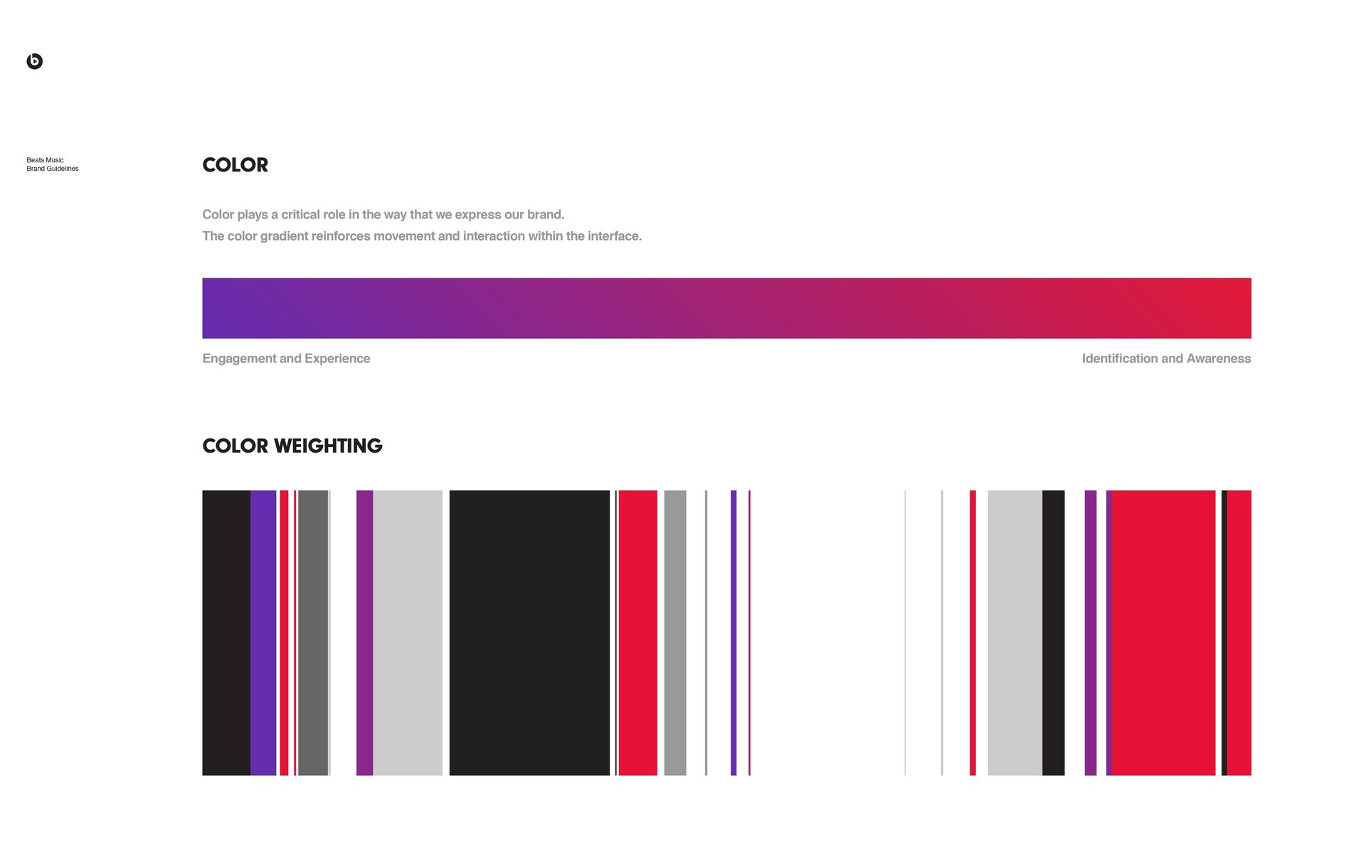
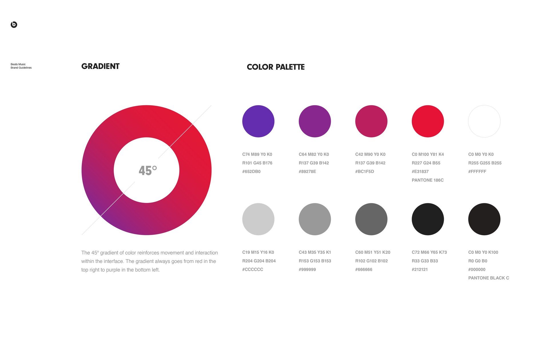
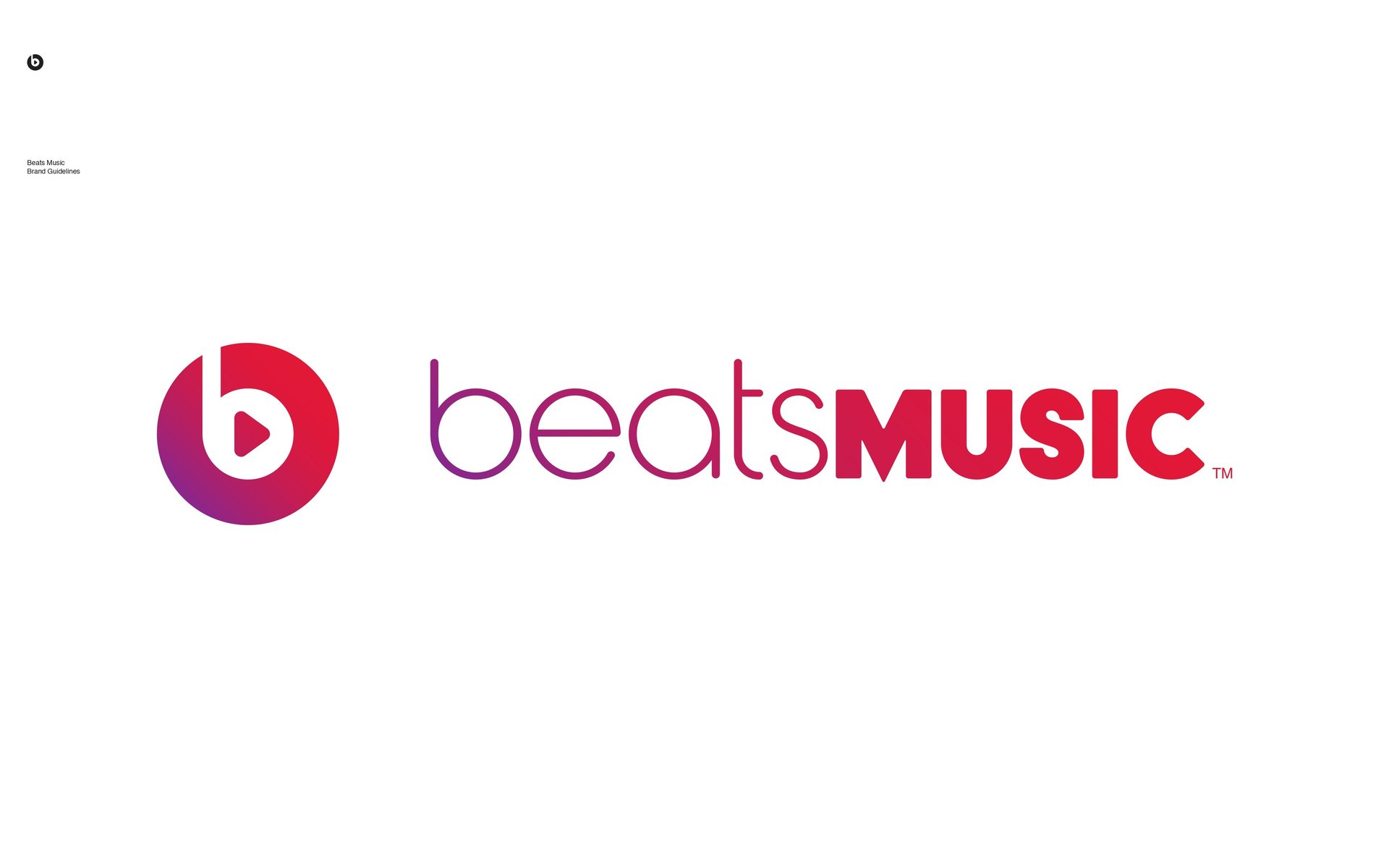
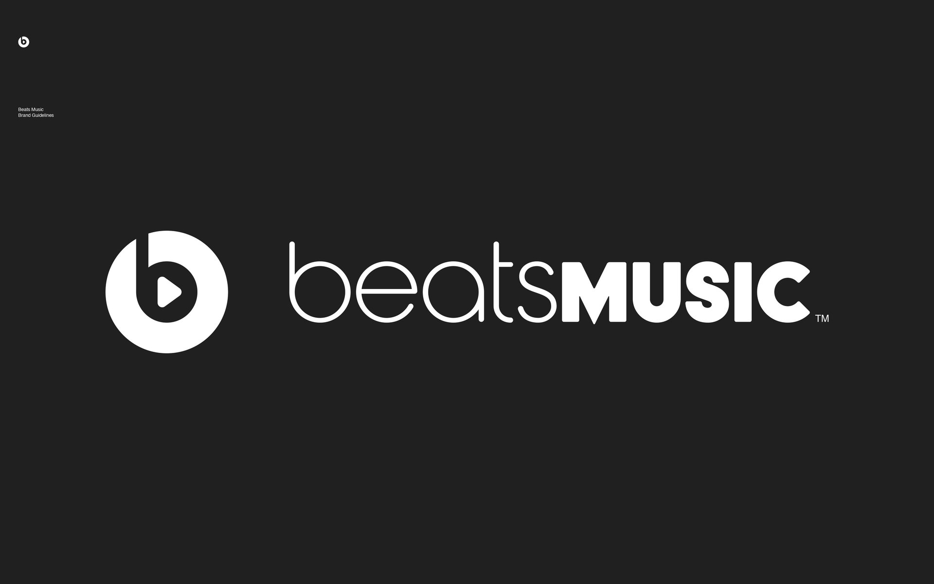
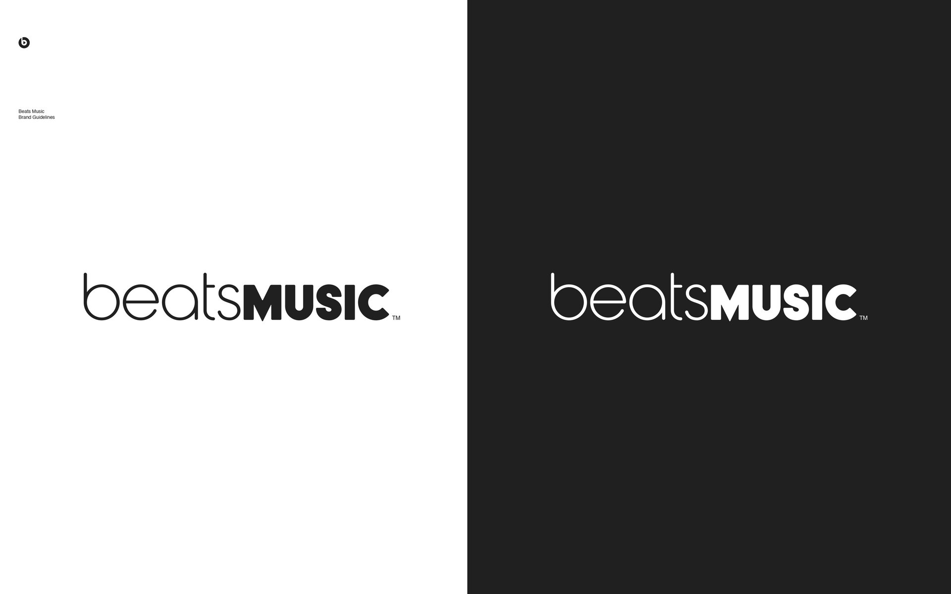
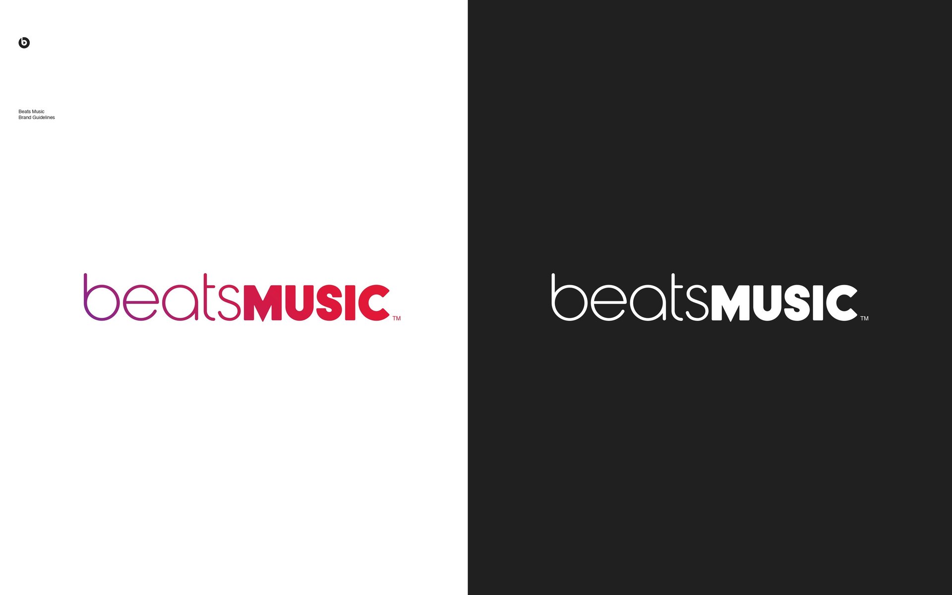
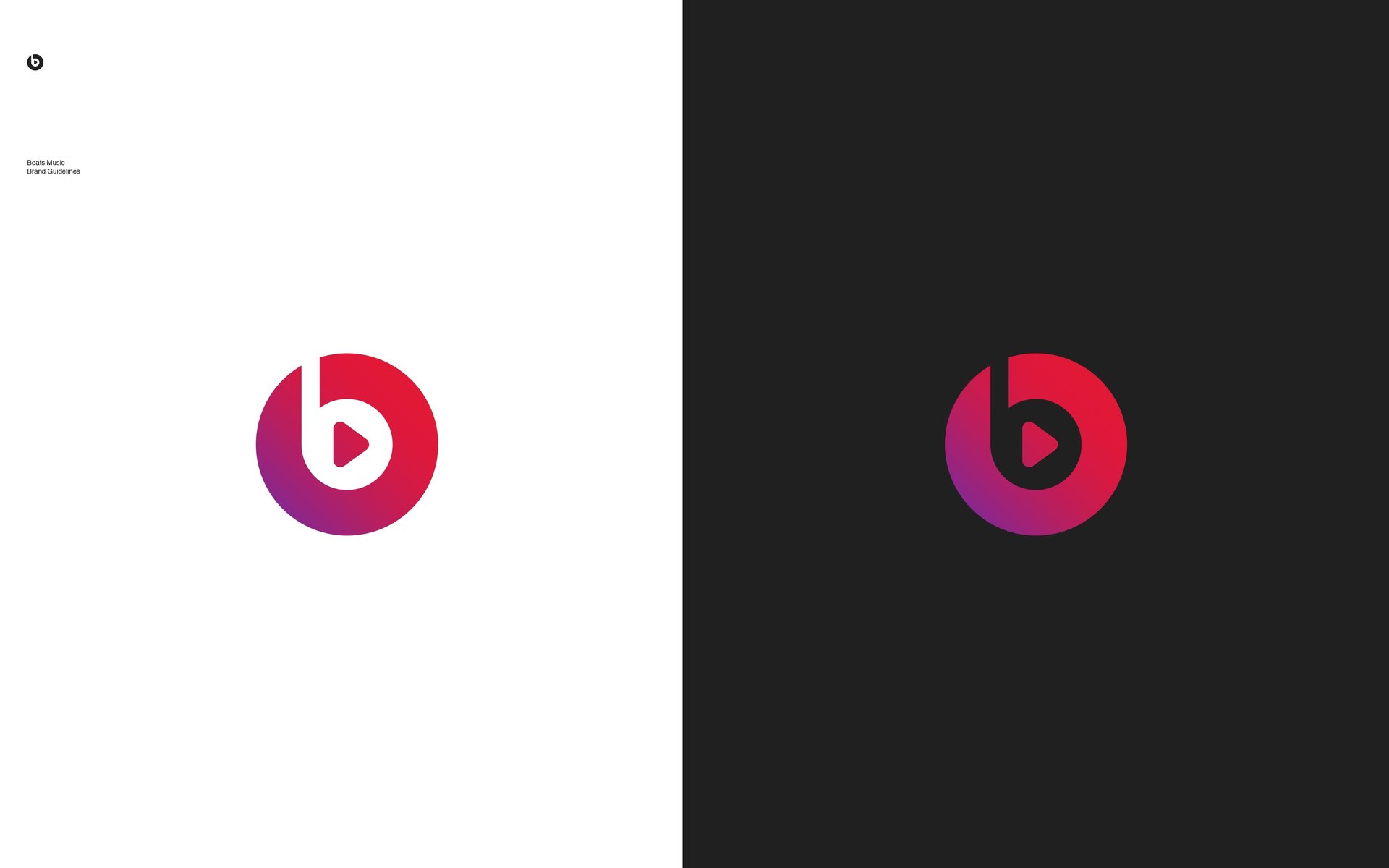
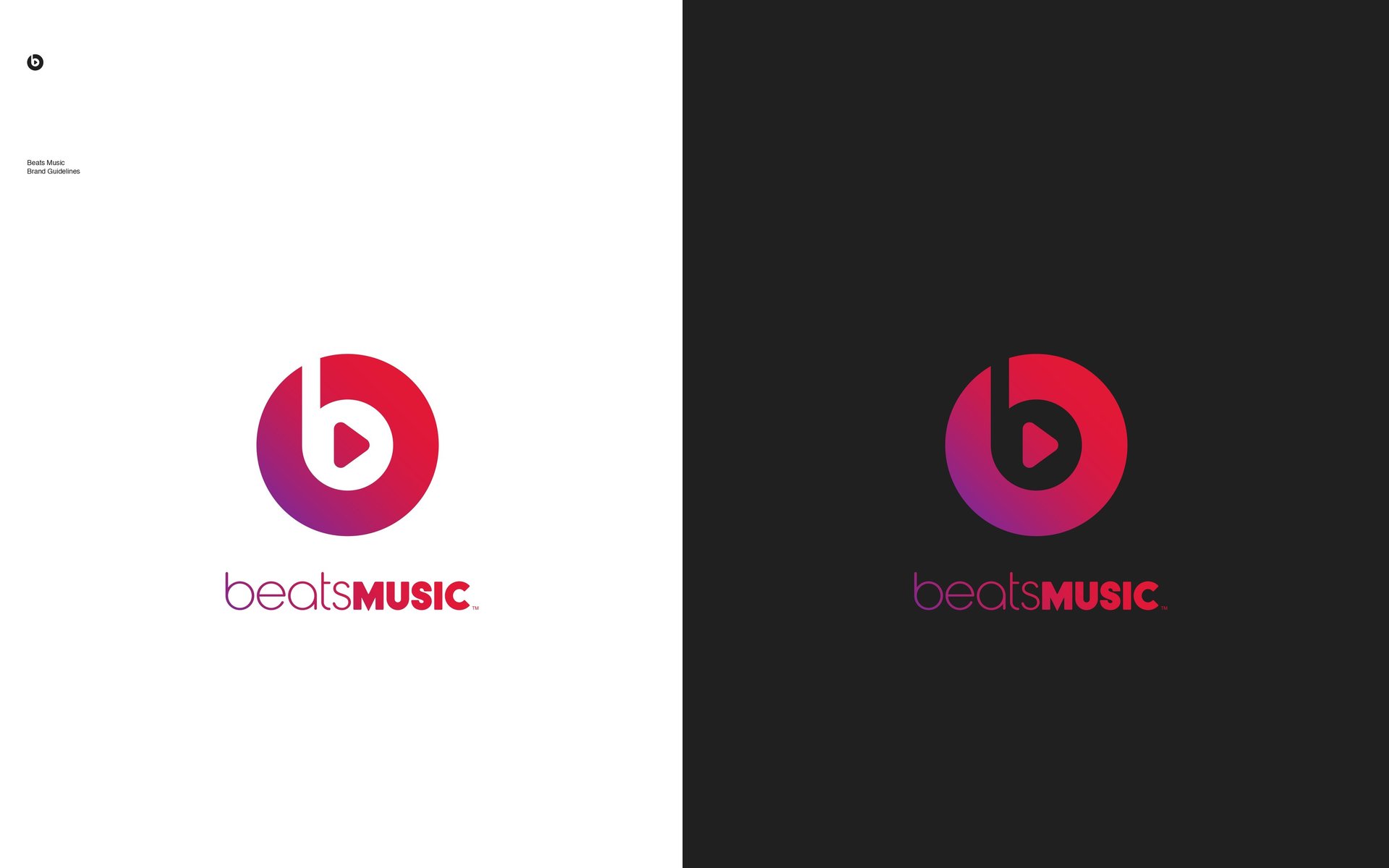
Beats Music was conceived as an offshoot of the highly successful Beats by Dre brand, inheriting the cultural cachet of its parent company while seeking to carve its own distinct niche. At the heart of the brand’s visual identity was a deliberate emphasis on bold minimalism. The color palette, for instance, relied heavily on a trinity of black, white, and the iconic Beats red. These hues were not selected merely for aesthetic value but for their symbolic resonance, black conveyed sophistication and authority, white offered clarity and balance, while red signified passion, intensity, and visceral engagement with sound. Together, they created a visual harmony that was both assertive and emotionally compelling.
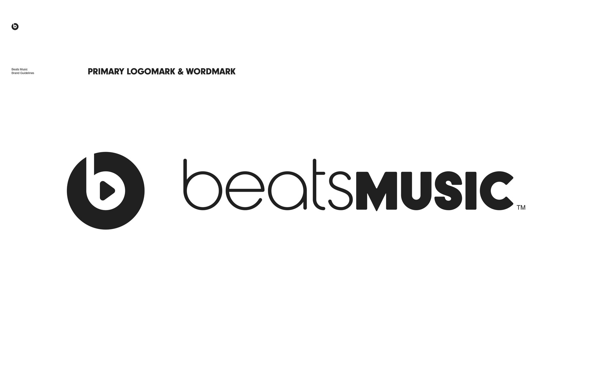
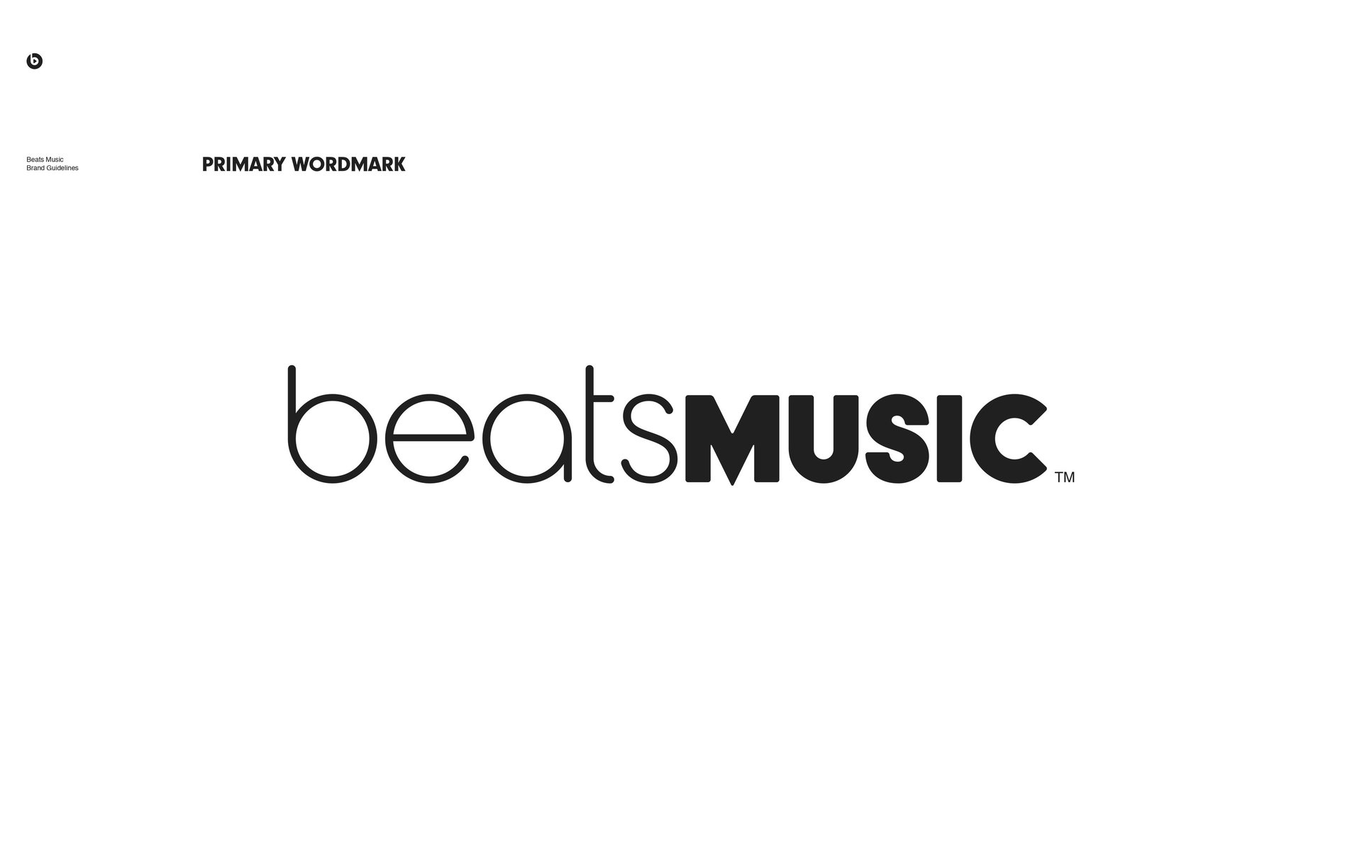
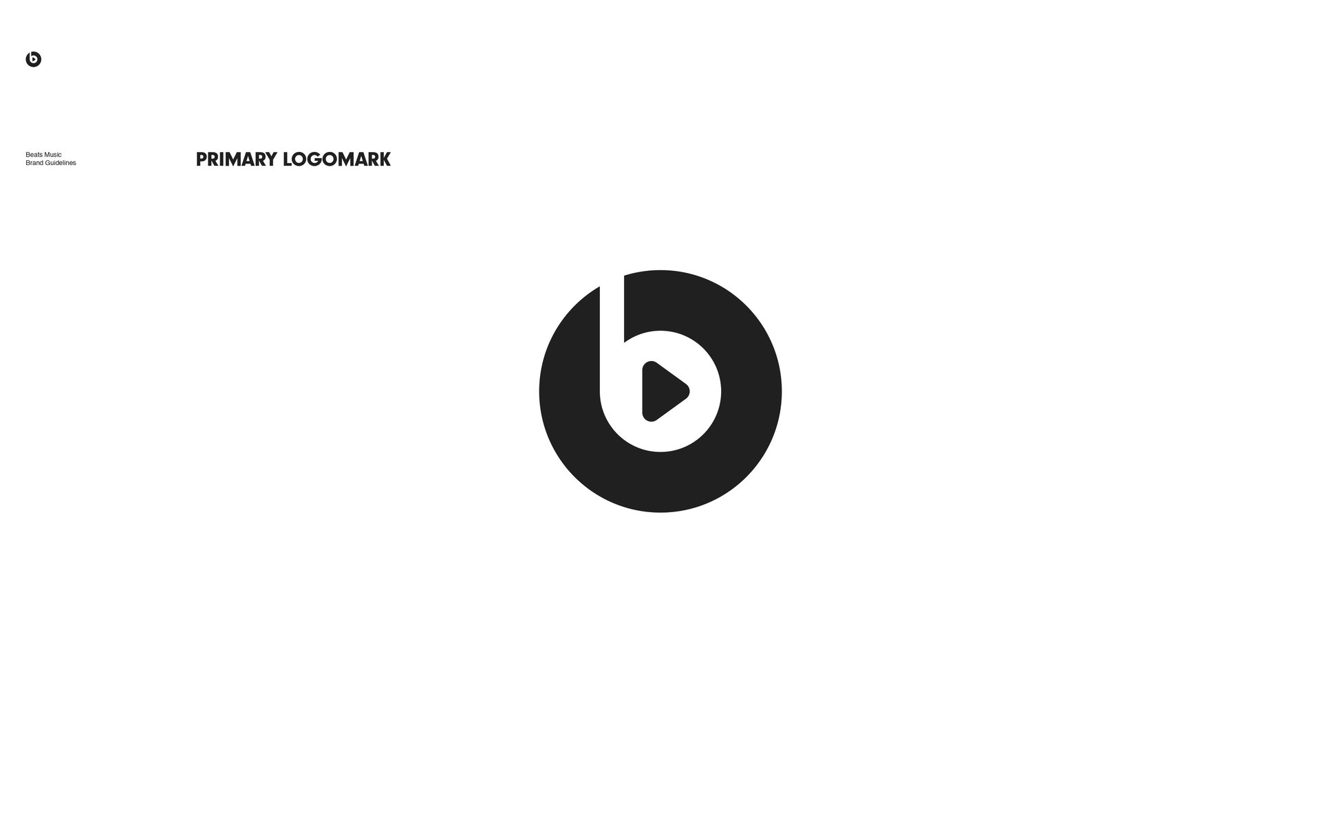
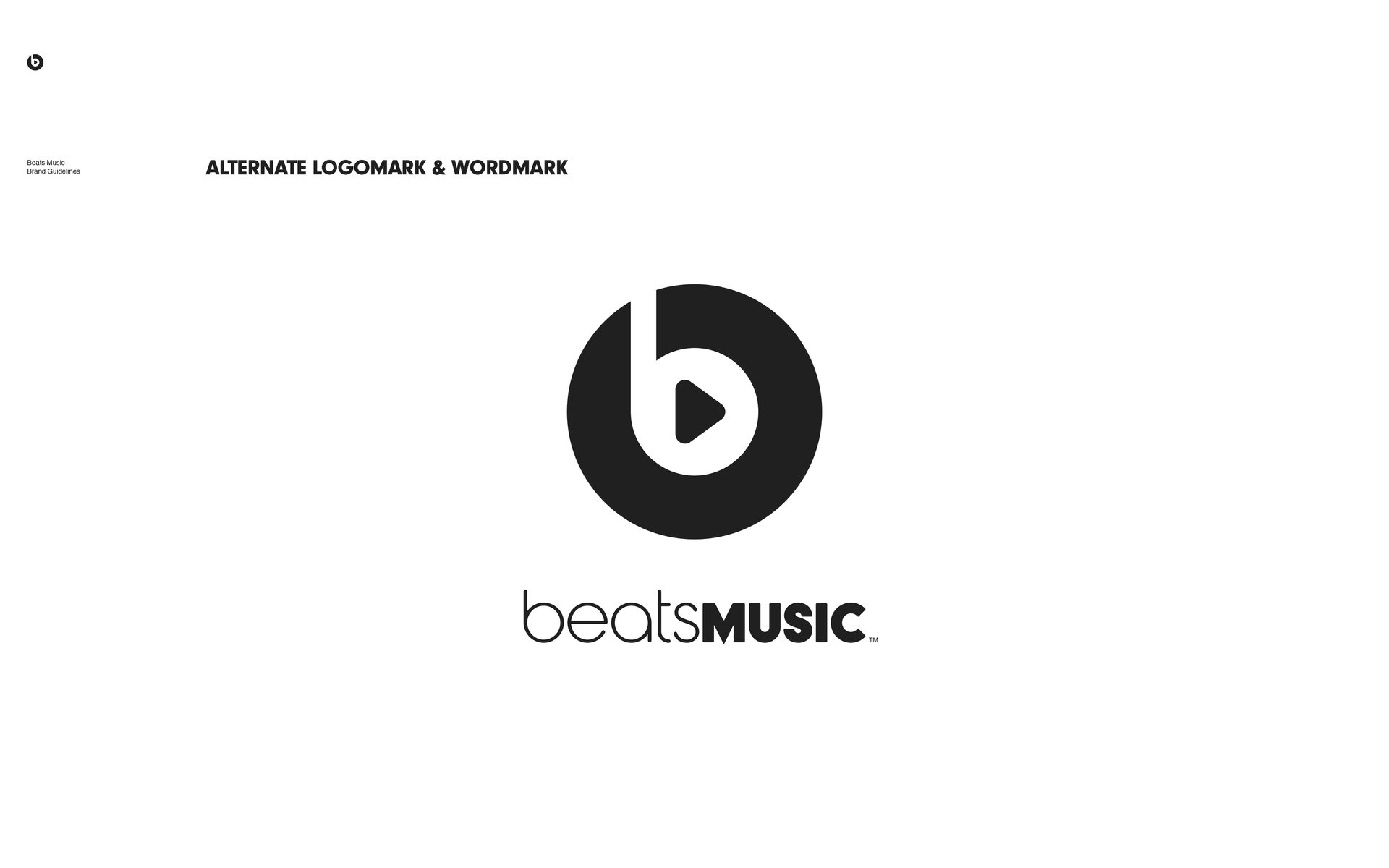
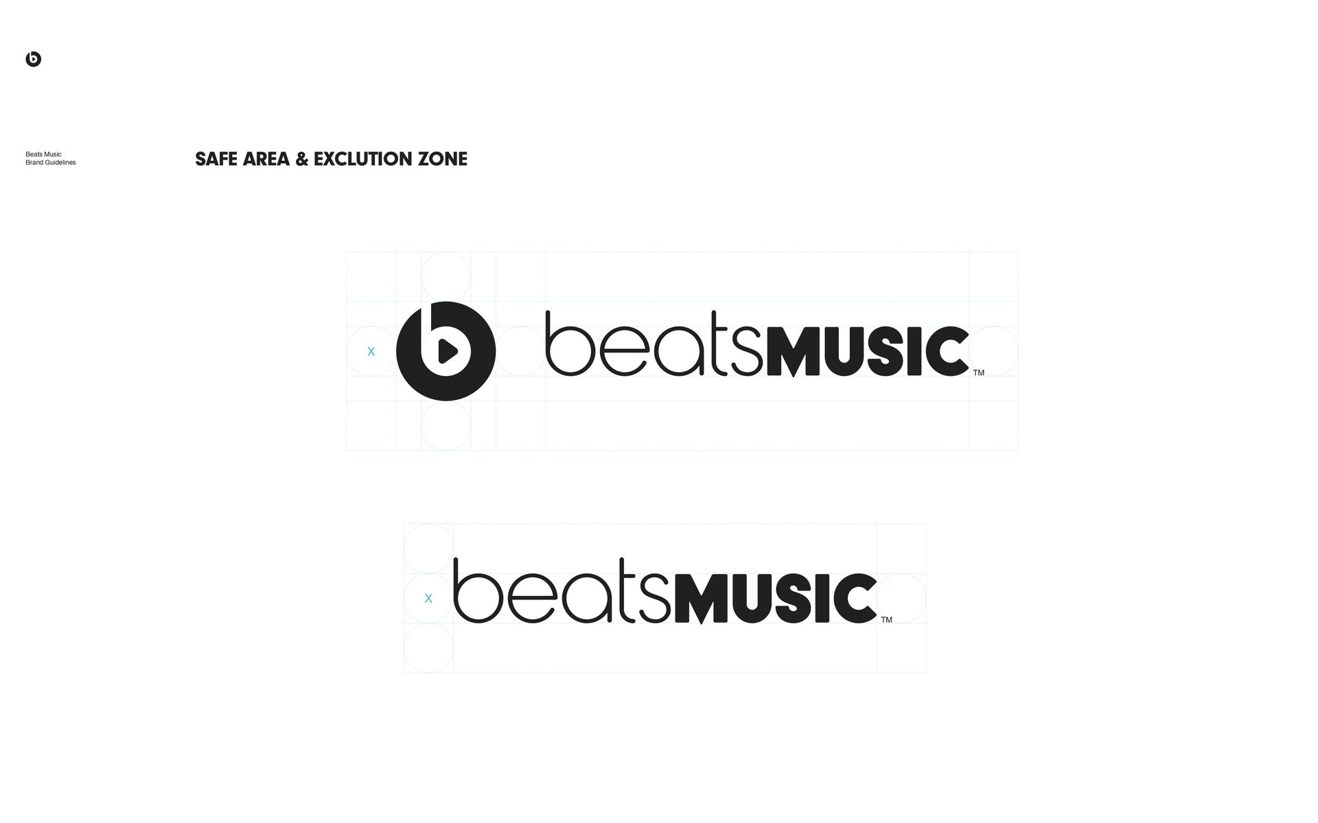
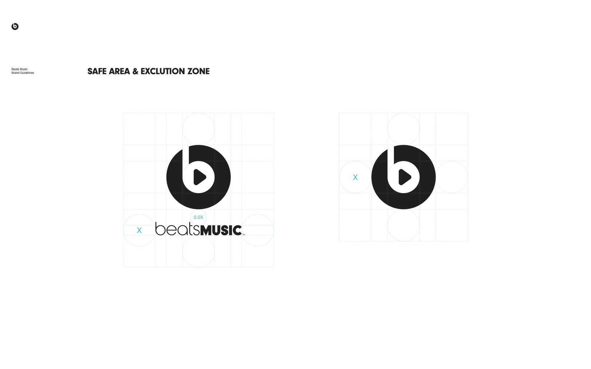
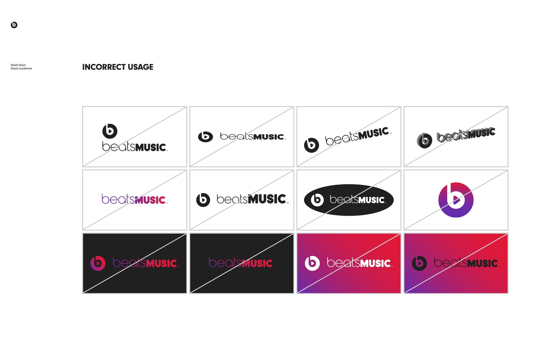
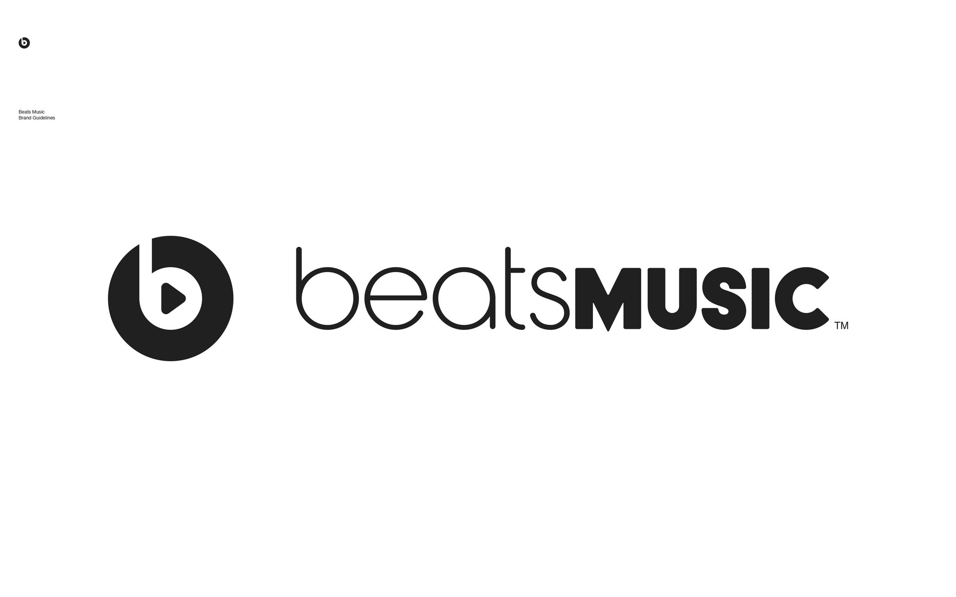
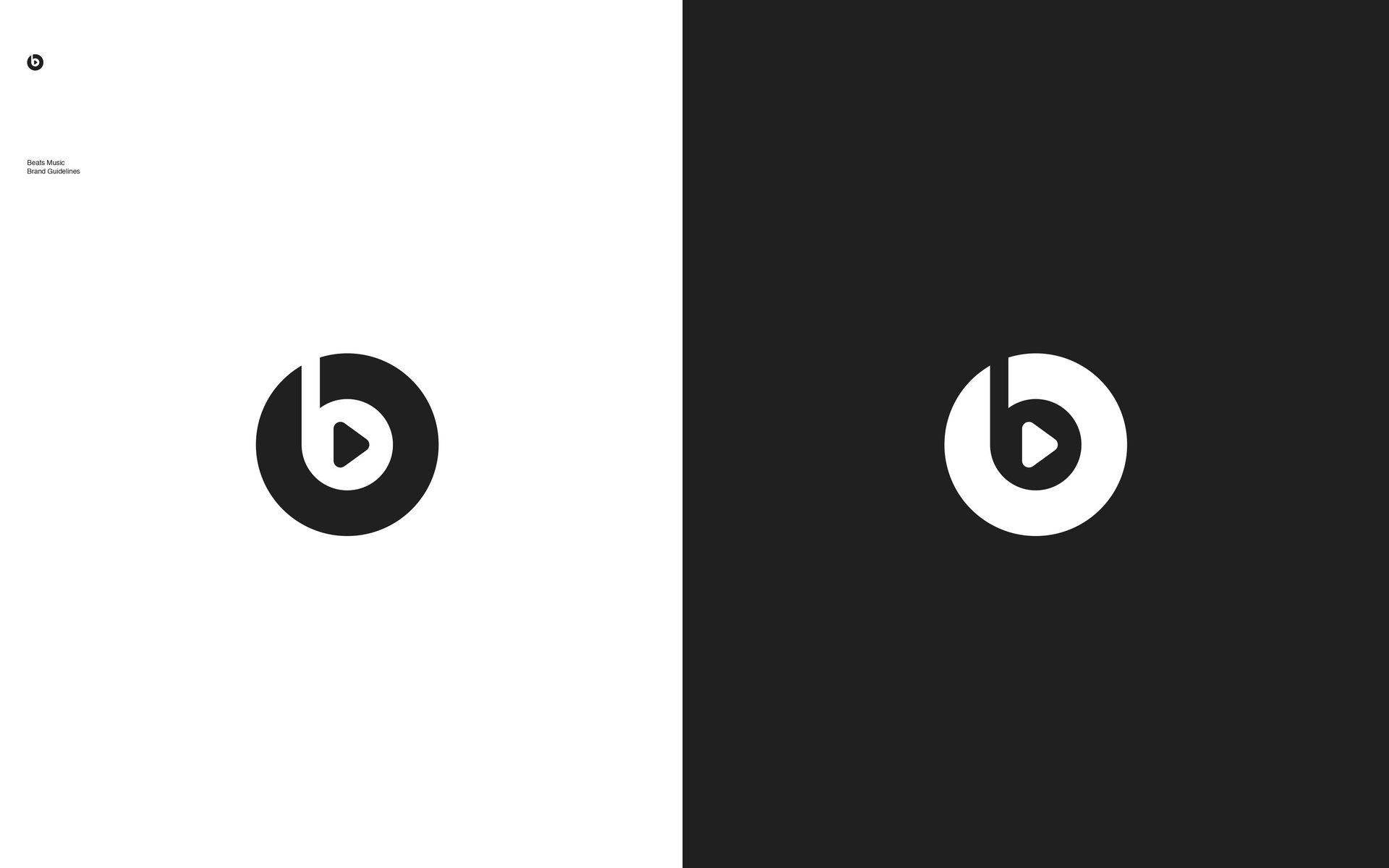
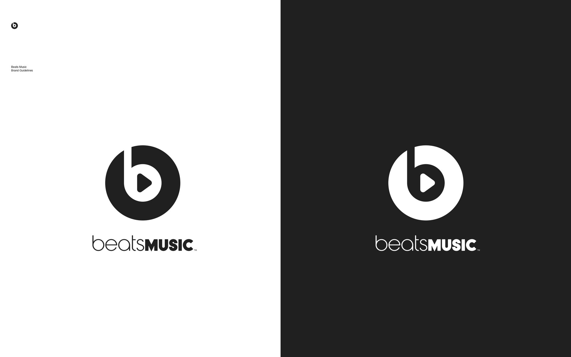
The logo, a reinterpretation of the original Beats “b” encased in a circle, served as a bridge between the parent brand and the new streaming venture. This continuity was strategic; it capitalized on the widespread recognition of Beats by Dre while simultaneously signaling a new auditory journey. The logo was designed to be versatile and scalable, maintaining visual clarity whether emblazoned across a billboard or embedded in a mobile app icon. Its geometric precision and visual economy made it instantly recognizable, a hallmark of effective branding.
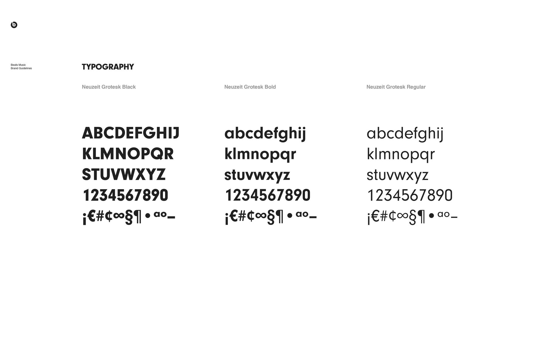
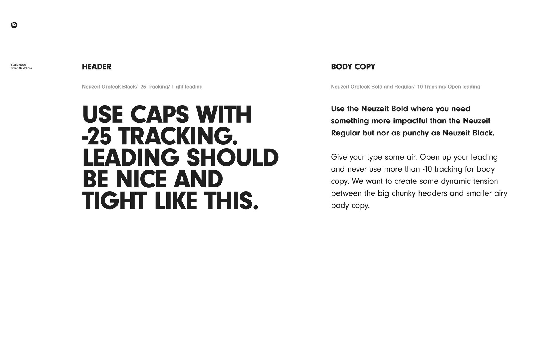
Typography in the Beats Music brand guidelines was approached with equal intentionality. Helvetica Neue, a sans-serif typeface known for its modern elegance and legibility, was the font of choice. Its neutrality allowed the brand’s content, be it a playlist description or editorial feature, to take centre stage. The type hierarchy was structured to guide the reader's attention fluidly, ensuring clarity across various mediums. This typographic consistency reinforced the brand’s voice: confident, contemporary, and unapologetically clean.
Beyond the surface of visual elements, the tone of voice employed by Beats Music played a pivotal role in differentiating the brand. It eschewed the impersonal, robotic vernacular commonly found in tech-driven services in favor of a voice that was warm, conversational, and steeped in cultural fluency. The brand spoke as a friend who knew your taste but also had the credibility of a seasoned music curator. Whether introducing a playlist or crafting push notification copy, the language was imbued with rhythm, energy, and human nuance. This linguistic approach deepened emotional resonance and fostered a sense of belonging among users.
Photography and imagery were also central to the brand guidelines. Beats Music opted for raw, documentary-style visuals that showcased real people immersed in authentic listening experiences. These images often employed high contrast and natural lighting to evoke a sense of intimacy and immediacy. Unlike competitors who leaned on stock imagery or abstract visuals, Beats Music humanized its product through visuals that felt honest and lived-in. The goal was to visually narrate the profound emotional impact music has on everyday life, bridging the digital experience with tangible human emotion.
Moreover, the brand’s motion design principles were carefully crafted to enhance user interaction. Transitions were smooth, intuitive, and paced with deliberation, echoing the tempo of music itself. Animations were not gratuitous but served functional and aesthetic purposes, guiding users, drawing attention to key features, and enriching the sensory experience of the app. Motion design, within the Beats Music ecosystem, was a tool for storytelling and immersion.
The editorial direction of Beats Music further emphasized curation over computation. While its competitors relied heavily on algorithmic recommendations, Beats Music championed human curatorship. The brand guidelines dictated a content strategy that was editorial in nature, articles, playlist descriptions, and featured content were written with journalistic flair and emotional intelligence. This was not simply about delivering music but crafting narratives around it. The language used in editorial content was rich, descriptive, and evocative, often drawing connections between music, identity, and cultural context.
Inclusivity and representation were also integral to the brand’s identity. Beats Music was acutely aware of its diverse user base and sought to reflect that in its visuals, language, and cultural references. The brand guidelines explicitly advocated for the inclusion of varied ethnicities, genders, and subcultures in all branding materials. This commitment to diversity was not performative but foundational, it acknowledged the universal language of music and the heterogeneous communities that engage with it.
From a strategic perspective, the brand guidelines operated as a cohesive framework that aligned all departments, design, marketing, product, and editorial, under a unified vision. Every campaign, every product update, and every social media post was filtered through the lens of the brand’s identity. This internal consistency fortified external perception, allowing Beats Music to present itself not just as a product, but as a cultural movement.
Even in its marketing collateral, the brand retained its core principles. Advertisements were visually arresting yet minimal, often featuring powerful stills of artists or listeners in emotionally charged moments. Taglines were succinct but impactful, such as "The Right Music, Right Now," encapsulating the brand’s promise in a single phrase. This clarity and resonance were direct results of the disciplined adherence to the brand guidelines.
Beats Music’s launch campaign further exemplified the efficacy of its branding framework. Collaborations with high-profile artists, culturally attuned messaging, and a strong emphasis on storytelling allowed the brand to gain significant traction despite fierce competition. These efforts were unified by a visual and verbal language that was consistent, compelling, and unmistakably Beats.
However, the brand’s trajectory was not without complexity. In 2014, Apple acquired Beats Music, and the service was eventually subsumed into Apple Music. While the original platform was short-lived, the influence of its branding reverberates through Apple Music’s current identity, evident in its increased emphasis on curated playlists, cultural storytelling, and a warmer, more personal tone of voice.
In retrospect, the brand guidelines of Beats Music in 2014 were a masterstroke in strategic identity creation. They demonstrated that even in a technology-driven marketplace, emotional authenticity, cultural literacy, and aesthetic discipline could forge a powerful brand. The guidelines served as both a blueprint and a belief system, shaping not just how the brand looked or sounded, but how it felt.
Ultimately, the legacy of Beats Music lies not in its longevity but in its depth of impact. It reframed the conversation around streaming by centering humanity in a digital experience. Through its brand guidelines, Beats Music proved that branding is not simply an exercise in design, it is an act of storytelling, a declaration of values, and a conduit for emotional connection. In that sense, Beats Music was not just a streaming service; it was a carefully orchestrated symphony of culture, design, and soul.
Let's discuss your project
Address
India
No. 788, Eterna, 15th Cross Road
1st Phase, J. P. Nagar, Bengaluru 560 078
Business Relations
PH: (+91) 90 081 58824
Monday - Saturday
09:00 AM - 06:00 PM (IST Timezone)
Talk to us
Communications - India
WA: (+91) 95 350 28020
Communications - Global
WA: (+91) 740 64 00010
Initial Point of Contact:
hello.castlespace@gmail.com
General Information Requests:
info@castlespace.in
Business and Sales Inquiries:
sales@castlespace.in
Client Assistance Channel:
support@castlespace.in
Press and Media Relations
pr@castlespace.in
Explore Career Opportunities:
careers@castlespace.in
Creative Design Correspondence:
design@castlespace.in
Socials
© Castle Space™ 2011 - 2026
All Rights Reserved by TEIRO SOLUTIONS LLP. Trademark pending for India, UAE, UK (T.No. 6174)
United Kingdom
8 St James's Square
London SW1Y 4JU
Business Relations
PH: (+44) 7342 33 2693
Monday - Saturday
09:00 AM - 06:00 PM (GMT Timezone)
United Arab Emirates
R-311-315, Jumeirah Living
Marina Gate 3, Dubai 1218 28
Business Relations
PH: (+971) 503 641 563
Monday - Saturday
09:00 AM - 06:00 PM (GST Timezone)
pronounced as;
- castle space: /ˈkɑːsl speɪs/
Brand Discovery
CSR
Sustainability
Research
Trend Reports
Global Outreach
Technology
Vetero 2.0
Playbook
Training
Public Relations
Media
Intellectual Property
Influencer Partnerships
Media Gallery
Internships
Consultations